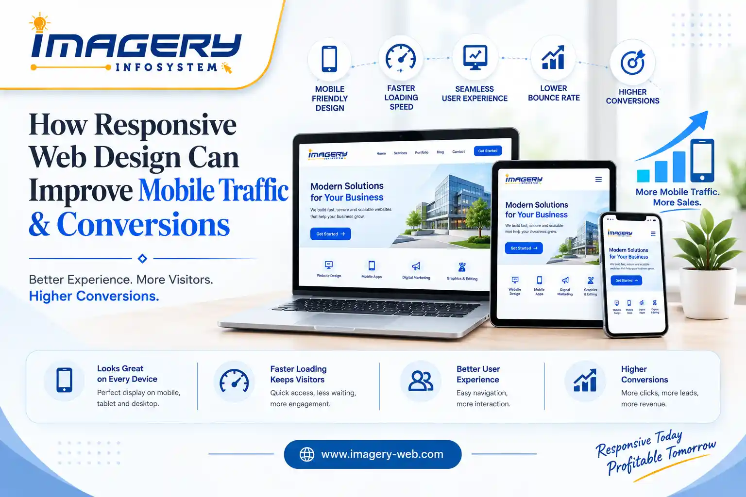
How Responsive Web Design Can Improve Mobile Traffic & Conversions
A website is often the first digital interaction a potential customer has with a business. If that experience is difficult on a smartphone, visitors may leave before they discover what the business offers.
Responsive web design addresses this problem by creating a flexible website experience that adapts to different screen sizes.
Instead of maintaining completely separate desktop and mobile websites, responsive design allows one website to adjust its layout according to the user’s device.
For modern businesses, this approach can support both mobile traffic and conversion opportunities.
What Is Responsive Web Design?
Responsive web design is a website development approach in which the layout and elements of a website automatically adapt to the available screen size.
On a desktop, a website might display multiple columns and larger navigation elements. On a smartphone, those same elements can reorganize into a single-column layout with mobile-friendly navigation.
Responsive design can adapt:
- Text and typography
- Images
- Navigation
- Buttons
- Forms
- Product displays
- Tables
- Content sections
- Page layouts
- Spacing and visual elements
The goal is to provide a usable experience regardless of whether someone visits the website from a desktop, tablet or smartphone.
Why Mobile Experience Matters
A visitor using a smartphone has different needs from someone browsing on a large desktop monitor.
Mobile users typically interact with websites through touch rather than a mouse and have considerably less screen space available.
If buttons are too small, text is difficult to read or visitors have to constantly zoom and scroll horizontally, the experience becomes frustrating.
Responsive design addresses these challenges by adapting the interface to the user’s screen.
A comfortable mobile experience can make it easier for visitors to explore pages, find information and take action.
Responsive Design Can Help Capture Mobile Traffic
Search engines, social media platforms, advertisements and other digital channels can send users directly to a website.
Many of these visits can originate from mobile devices.
If a website provides a poor mobile experience, businesses may struggle to make the most of the traffic they are already attracting.
A responsive website gives mobile visitors a layout designed for their device, helping them interact with the content without unnecessary obstacles.
For businesses targeting customers in Agartala, Tripura and Northeast India, mobile-friendly design can therefore be an important component of their broader online strategy.
Better Navigation Makes Visitors More Comfortable
Navigation is one of the most important elements of a mobile website.
Desktop navigation menus can contain many options, but displaying the same menu on a small smartphone screen can make the interface crowded.
Responsive websites can use mobile-friendly navigation patterns that make important sections easier to access.
Visitors should be able to quickly find information such as:
- Products or services
- Pricing
- Contact information
- About the business
- Location
- Booking or enquiry options
- Shopping cart
- Customer support
When visitors can find what they need without unnecessary effort, the overall user experience improves.
Mobile-Friendly Buttons Can Support Conversions
A conversion might be a purchase, enquiry, booking, registration, phone call or another action that matters to the business.
On a mobile device, buttons need to be easy to identify and interact with.
A responsive design can adjust button size, spacing and placement based on the screen.
For example, a restaurant website might make the “Order Now” button prominent on mobile.
A service business might highlight “Get a Quote” or “Contact Us.”
An ecommerce store might make “Add to Cart” and checkout actions easier to access.
The objective is to reduce friction between the visitor and the action the business wants them to take.
Faster Mobile Experiences Can Reduce Friction
Responsive design and website performance are closely connected, although they are not exactly the same thing.
A responsive website should be built efficiently so that users are not unnecessarily downloading large resources or processing complicated layouts.
Performance optimization can include:
- Image optimization
- Efficient code
- Browser caching
- Appropriate image dimensions
- Reduced unnecessary scripts
- Optimized fonts
- Efficient page architecture
A website that responds quickly can provide a smoother experience for mobile visitors, particularly when users are accessing it through slower or less stable connections.
Responsive Design Supports Mobile SEO
Mobile usability is also relevant to search engine optimization.
Search engines aim to provide users with useful pages and a good overall experience.
A responsive website gives businesses a consistent URL and content structure across devices while allowing the layout to adapt to the user’s screen.
Mobile optimization should therefore be considered alongside other SEO practices such as:
- Relevant content
- Search intent
- Technical SEO
- Page performance
- Internal linking
- Structured data
- Descriptive metadata
- Image optimization
Responsive design alone does not guarantee higher rankings, but it can provide an important technical foundation for a mobile-friendly website.
Better Product Browsing for Ecommerce Businesses
For ecommerce websites, mobile responsiveness can have a direct impact on the shopping experience.
Customers may discover a product through social media or search, click through to the website and immediately begin browsing from their smartphone.
If product images, descriptions, filters or buttons do not work properly on mobile, the customer journey can become difficult.
A responsive ecommerce website can adapt product grids, filters, images and purchase actions to smaller screens.
This allows customers to browse products and move toward checkout more comfortably.
Mobile-Friendly Forms Can Generate More Leads
Forms are commonly used by service businesses to generate enquiries.
However, forms designed primarily for desktop users can be difficult to complete on smartphones.
A responsive form can adjust its fields and layout for smaller screens.
Businesses should avoid asking for unnecessary information and make the submission process as straightforward as possible.
For example, a website offering web development services might use a short enquiry form requesting only essential project details.
Reducing unnecessary friction can make it easier for interested visitors to contact the business.
Responsive Design Can Improve Brand Perception
Website design influences how visitors perceive a business.
A website that looks outdated or behaves poorly on mobile can make the overall digital presence feel less professional.
A responsive website can provide a consistent visual identity across different devices.
Brand elements such as typography, colors, imagery, buttons and layouts can remain consistent while adapting to different screen sizes.
This creates a more unified brand experience.
One Website Can Simplify Maintenance
Another advantage of responsive design is that businesses can manage one primary website rather than maintaining separate desktop and mobile versions.
When content needs to be updated, the same website can serve visitors across different devices.
This can simplify:
- Content updates
- SEO management
- Website maintenance
- Analytics
- Design improvements
- Technical updates
It can also reduce the risk of inconsistencies between separate mobile and desktop websites.
Responsive Design and Social Media Traffic
Social media is an important source of website traffic for many businesses.
People often discover posts and advertisements while using smartphones.
When they click a link from Instagram, Facebook, X or another platform, they may immediately arrive at the business website through a mobile browser.
This creates a direct connection between social media marketing and responsive web design.
A successful social media campaign can generate attention, but the website needs to continue the experience.
If the landing page is mobile-friendly, visitors can more easily explore the offer and take the next step.
Local Businesses Can Benefit From Mobile-Friendly Websites
For local businesses, mobile visitors may be searching for information while they are already considering a purchase or service.
A potential customer might search for a web development company, restaurant, educational service, repair business or other local provider from a smartphone.
A responsive website can make important information easier to access.
This can include:
- Phone number
- Address
- Business hours
- Services
- Product information
- Enquiry forms
- Directions
- Booking options
For businesses in Agartala and across Tripura, making this information easily accessible on mobile can strengthen the overall local digital experience.
Also Read This Blog- ”Why Businesses Need Professional Digital Branding in Competitive Markets”
Testing Is Essential
A website should not be considered responsive simply because it technically changes size.
It should be tested across different devices and screen sizes.
Businesses should check:
- Navigation
- Images
- Text readability
- Buttons
- Forms
- Product pages
- Checkout
- Pop-ups
- Page speed
- Contact options
- Embedded content
Testing on real devices can reveal usability problems that may not be obvious when viewing a website only on a desktop computer.
Responsive Design Should Support Business Goals
Good web design is not only about making a website look attractive.
The website should support the objectives of the business.
For an ecommerce company, this could mean improving product discovery and checkout.
For a service company, it could mean generating more enquiries.
For a restaurant, it could mean increasing online orders or reservations.
For an educational organization, it could mean increasing registrations.
Responsive design should therefore be planned around the actions that matter to the business.
How Imagery Infosystem Can Help
Imagery Infosystem focuses on creating websites that combine responsive design, usability, performance and business-focused development.
For businesses that want to improve their existing website or build a new digital platform, responsive design can be incorporated from the beginning rather than treated as an afterthought.
The development process can focus on creating experiences that work effectively across smartphones, tablets and desktops while keeping the business’s brand and objectives in mind.
For businesses in Tripura, Northeast India and beyond, this can provide a stronger foundation for digital marketing, SEO and customer engagement.
Success Stories: Real Results from Imagery Infosystems’
Conclusion
Mobile traffic represents an important opportunity for modern businesses, but attracting mobile visitors is only one part of the equation.
The website must also provide an experience that makes it easy for visitors to find information, understand an offer and take action.
Responsive web design helps create that foundation by adapting websites to different devices and screen sizes.
When responsive design is combined with fast performance, clear navigation, strong content, mobile SEO and conversion-focused experiences, businesses can create a more effective digital presence.
For businesses looking to improve their mobile experience and build a website capable of supporting long-term growth, responsive design should be an essential part of the development strategy…
🚀 Contact Imagery Infosystems today and elevate your business to the next level!

By- Imagery Infosystem
India's Leading IT & Digital Solutions Company